Watsons in-store design wins hearts and souls
Design is vital in building great brands, from the smallest consumer product to ingenious house-filling furniture. Apple Stores have been famously designed to match their products, but it is arguably a greater challenge to design a distinctive global retail environment that sells hundreds of unique items while also developing a distinctive connection to your customers. Watsons’ stores are meeting this challenge, from Istanbul to Beijing, by focusing on hearts and souls.
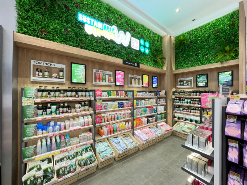
Design is an evolving process at Watsons and there are generational iterations that guide the look, feel and layout of its stores across the Asian continent. Generation 9 (G9) is currently being rolled out in new and renovated stores. Colourful outlets, circa 2005, gave way to a bright white, clinical feel for G5 and G6 iterations launched in 2009 and 2012 respectively. Now, the G9 stores emphasise a relaxed, warmer feel using natural lighting, wood panelling and greenery. “Our customers have a yearning for a connection to a comfortable shopping environment,” says Fanny Lam, Commercial Development Director at Watsons International. “When they come into the store, we are delivering that, while also answering another desire: the desire for experience.” To accommodate this, designers are replacing shelf space with “experience space” that allows loyalists to express their deepest held values in partnership with Watsons.
Watsons’ stores are meeting this challenge ... by focusing on hearts and souls.

The heart wants what it wants
To give the heart what it wants, design is transforming outlets to include sustainable elements and experiential enclaves that reflect the values of the customers coming into the stores.
One of the most widely held values is a concern for the environment. Surveys across markets as diverse as Thailand, Türkiye, Taiwan and Malaysia show that consumers want their purchases to reflect their green hearts. Hearing the people, A.S. Watson Group developed the Greener Stores Global Framework to accelerate a more sustainable way of retail, and Watsons introduced sustainable elements within their stores including refill stations for Watsons
Visual cues and practical measures in store design also support these values. Customers often notice how brands align with their environmental aims. Watsons’ high-impact measures include the use of prefabricated materials, and modular and flexible furniture that can be repurposed instead of heading for landfill when a store refurbishment is undertaken. In some selected stores, customers with a critical eye look for – and find – recyclable materials such as bamboo and sugarcane accompanying energy-saving LED lighting. It looks green because it is green.


People: More relationship, less transaction
It is a paradox of the Internet age that people want both more human contact and less human contact. The paradox can be explained by the changing nature of the relationships they choose to have.
People want both more human contact and less human contact. The paradox can be explained by the changing nature of the relationships they choose to have.
Service with a Smile was the title of a comedic 1961 novel by P.G. Wodehouse, and the motto has been adopted by companies ever since. In the 21st century, the smile is a necessary minimum for in-store service – but it is hardly sufficient. When people put in the time and effort to go to the store, they expect an experience beyond what online shopping has to offer. Watsons delivers that experience.
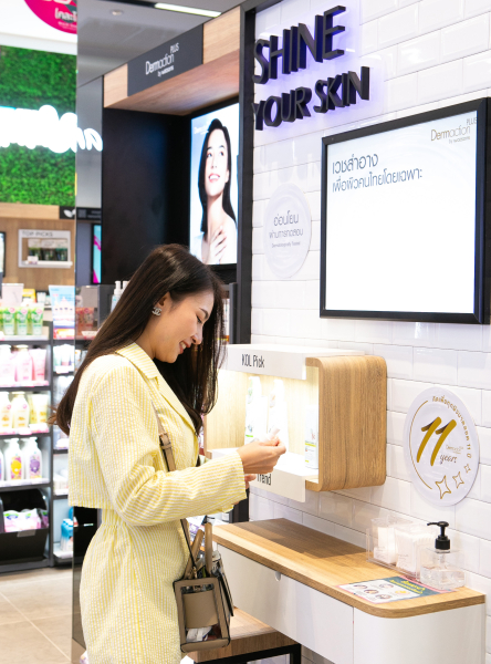
For example, space in stores is being opened up for skincare workshops and personalised makeup advice at stations staffed by specially trained advisers. Health is another key reason that people come to Watsons. In-store pharmacists have personal conversations about health with customers so that they don’t just look good, they also feel great. Watsons is delivering on those expectations both
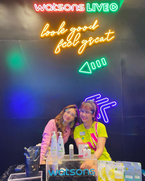
At Watsons, staff in designated locations build a cohort of online followers as key opinion leaders (KOLs) by livestreaming new product showcases showing customers how to use highlighted products. Curious customers come to ask questions or even take a selfie with their favourite KOLs in front of a studio backdrop to share on their Snapchat, Instagram or TikTok posts.

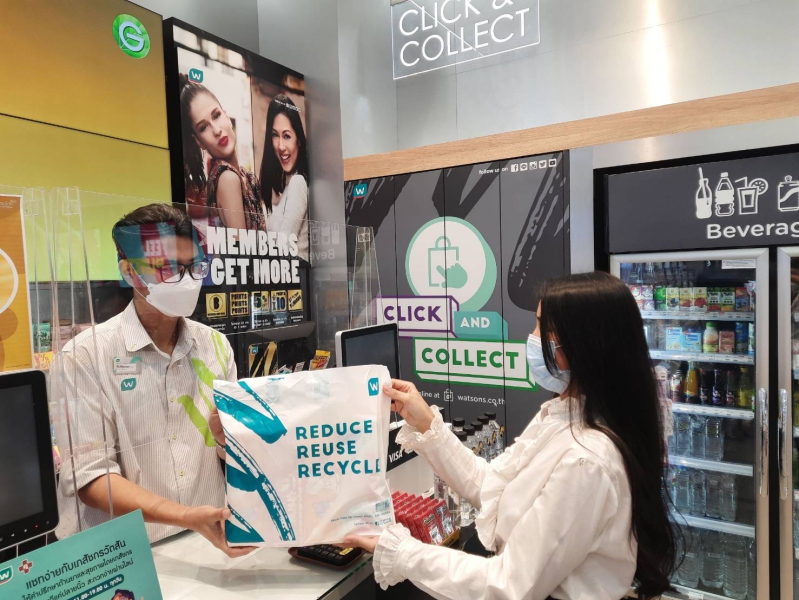
Shopping preferences vary widely. Some customers would rather try on products at home (using Watsons’ virtual makeup tool #ColourMe or the foundation finder), complete the sale online and just come in to use the Click & Collect service before making a speedy exit. Others make a decision about what to buy online and then use the self-checkout at the store. Some customers even shop in-store using Endless Aisle, a digital shelf displayed on a large touchscreen. They can then choose either in-store pickup or home delivery. The new “O+O” walls highlight trending products from the app and website so that shoppers who find interesting items online can make a beeline to those products in the store.
Trust in Watsons goes both ways. One new feature popular in Watsons’ Mainland China outlets that is being brought to Hong Kong and Singapore, is WatsonsGO, a touchless payment system. Customers can simply scan the barcodes of the products they want to buy with the Watsons mobile app and pay in-app. The use of technology allows Watsons to offer a more efficient and seamless checkout experience, while at the same time allowing its staff to stay focused on serving customers. After all, in-store service is more about building stronger relationships with customers than just closing the transaction.
Design has to cater carefully to the modern appetite for integrated experiences, multiple checkout options and bespoke advisory services at the expense of traditional shelf and checkout space. The combined offline and online sales experience improves as consumers come to see Watsons as more than just a store to buy things from. Watsons becomes a part of their lives, reflecting their values and connecting to their hearts.
Design has to cater carefully to the modern appetite for integrated experiences, multiple checkout options and bespoke advisory services at the expense of traditional shelf and checkout space.